Mastering color matching is essential for creating harmonious designs in fashion, interiors, and beauty. Understanding the color wheel helps identify complementary and analogous hues, while tools like online apps ensure precision. This guide offers practical tips for novices and professionals to craft stunning, balanced color combinations effortlessly.
Understanding the Basics of Color Coordination
Color coordination is the art of selecting colors that work harmoniously together to create visually appealing effects. It begins with understanding the fundamentals of color theory, which explores how colors interact and influence one another. Key principles include the color wheel, which organizes colors based on their hues, and the concept of color harmony, achieved through complementary, analogous, or triadic combinations. Neutrals like black, white, and gray play a crucial role in balancing bold colors, while undertones (warm or cool) help determine how colors blend. Mastery of these basics ensures cohesive and stylish color schemes in design, fashion, and beyond.
Why Color Matching is Important in Fashion and Design
Color matching is essential in fashion and design as it enhances aesthetic appeal and creates harmony. It ensures that outfits, products, and spaces look cohesive and visually pleasing. Proper color matching can evoke emotions, convey messages, and align with brand identities. In fashion, it helps individuals express their style and flatter their features. For designers, it ensures consistency and professionalism in their work. Accurate color matching also influences consumer perceptions, making it a critical tool for creating successful designs and trends. Its impact extends across industries, from clothing to interiors, shaping how we experience and interact with our surroundings.
The Color Wheel: A Fundamental Guide
The color wheel is a circular tool organizing colors, showing how they relate. It begins with primary colors, mixes them into secondary hues, and demonstrates warm and cool tones, aiding in creating harmonious palettes.
Primary, Secondary, and Tertiary Colors Explained
Primary colors—red, blue, and yellow—are the base hues that cannot be created by mixing others. Secondary colors, such as orange, green, and violet, are formed by combining two primary colors. Tertiary colors result from mixing a primary and a secondary color, creating shades like yellow-green or blue-violet. These categories form the foundation of the color wheel, helping to identify relationships and contrasts. Understanding these distinctions is key to effective color matching and creating balanced, visually appealing combinations in design, fashion, and art. This structure simplifies the process of selecting harmonious colors for any creative project.
Complementary, Analogous, and Triadic Color Combinations
Complementary colors are pairs opposite each other on the color wheel, like blue and orange, creating vibrant contrasts. Analogous colors are three consecutive hues, such as blue, teal, and green, offering harmony. Triadic colors, like red, yellow, and blue, form a triangle on the wheel for dynamic contrast. Complementary combinations enhance visual impact, while analogous create cohesion. Triadic schemes add energy to designs. These strategies help in crafting balanced and visually appealing color palettes for various creative projects, ensuring a professional and polished look in fashion, art, or interior design.
How to Use the Color Wheel for Perfect Matches
To achieve perfect color matches, start by identifying your base color on the color wheel. Select complementary colors for bold contrasts or analogous hues for seamless transitions. For a balanced look, use the 60-30-10 rule: 60% dominant color, 30% secondary, and 10% accent. Test your palette by creating a swatch or digital preview. Adjust tones to ensure harmony, considering warm and cool shades. This method ensures cohesive and visually appealing color schemes for fashion, design, or decor, making the color wheel an indispensable tool for creative projects.

Color Theory and Harmony
Color theory explores how colors interact, creating balance and visual appeal. Understanding harmony helps in designing cohesive palettes, enhancing aesthetic experiences across art, fashion, and design.
Understanding Warm and Cool Colors
Warm colors, such as red, orange, and yellow, evoke warmth and energy, often associated with sunlight and excitement. Cool colors—blues, greens, and purples—create a calming, soothing effect, reminiscent of water and shade. Understanding this distinction helps in designing balanced palettes, guiding focus, and evoking specific moods. Warm tones advance visually, while cool tones recede, creating depth in compositions. This fundamental contrast is key in art, fashion, and design, enabling the creation of harmonious and emotionally engaging color schemes. Mastering warm and cool colors enhances visual storytelling and aesthetic appeal.
The 60-30-10 Rule for Balanced Color Schemes
The 60-30-10 rule is a timeless principle for creating balanced and harmonious color schemes. It suggests that 60% of a design should be a dominant color, 30% a secondary color, and 10% an accent color. This proportion ensures visual equilibrium, preventing overwhelm while adding interest. For example, a room might feature warm neutrals (60%), complementary tones (30%), and vibrant accents (10%). This rule applies universally, from fashion to interior design, helping creators craft cohesive and aesthetically pleasing compositions. It’s a simple yet effective guide for achieving balance and harmony in color coordination.
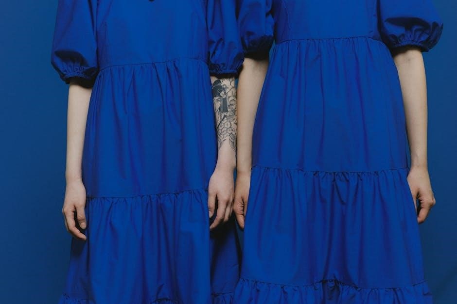
Monochromatic, Contrasting, and Neutral Color Schemes
Monochromatic color schemes use varying shades of a single color for a cohesive look, creating harmony and simplicity. Contrasting schemes combine colors that oppose each other on the color wheel, like black and white, to create visual drama. Neutral color schemes rely on non-colors such as beige, gray, or taupe to provide a calm, versatile backdrop. These approaches can be mixed and matched to suit different styles and preferences, offering flexibility for both subtle and bold designs in fashion, home decor, and art. Each method ensures a balanced and visually appealing outcome, catering to diverse aesthetic goals.

Practical Tools for Color Matching
Explore essential tools like color matching apps, online pickers, and physical swatches, plus designer software, to streamline your color selection process effectively.
Using Online Color Matching Tools and Apps
Online color matching tools and apps provide instant solutions for selecting harmonious shades. Platforms like Adobe Color, Color Hunt, and Canva offer features to generate palettes, explore trends, and preview combinations. Many tools allow real-time color generation from images, ensuring precision for designers, fashion enthusiasts, and homeowners. Apps such as ColorSnap and Paint Your Place enable users to visualize colors on surfaces or fabrics. These resources are invaluable for creating cohesive looks, whether for branding, outfits, or interior spaces, making color coordination accessible and efficient for everyone.
How to Create a Personalized Color Palette
Creating a personalized color palette involves selecting shades that reflect your style or brand. Start by choosing a base color, often inspired by a favorite item or trend. Use the color wheel to identify complementary or analogous hues that naturally harmonize. Tools like Adobe Color or Canva can help generate and refine palettes. Consider the 60-30-10 rule to balance dominant, secondary, and accent colors. Experiment with combinations to ensure visual appeal and cohesion. Save your palette for easy reference, ensuring consistency across projects or outfits. This tailored approach enhances creativity and ensures a polished, professional look.
Essential Tips for Mixing and Matching Colors
Mixing and matching colors effectively starts with understanding the basics of color harmony. Always begin with a neutral base to balance bold hues. Use the 60-30-10 rule: 60% dominant color, 30% secondary, and 10% accent. Experiment with patterns and textures to add depth without clashing; Neutral shades like beige or navy are versatile for grounding bold tones. Test combinations on a mood board or digitally before committing. Consider personal style and context, ensuring cohesion. For example, warm tones pair well for autumn looks, while cool tones suit spring designs. Practice makes perfect—experiment to refine your technique and achieve polished results.
Fashion and Clothing Color Combinations
Fashion and Clothing Color Combinations explore how hues elevate outfits. Harmonious palettes balance aesthetics and personal style, creating versatile, confident looks that captivate and inspire.
Best Practices for Matching Colors in Outfits
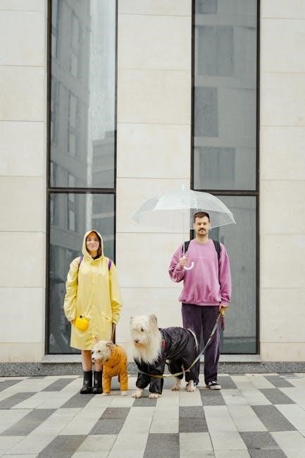
Mastering color coordination in fashion involves understanding complementary hues and balancing contrasts. Start with a base color and add complementary shades for harmony. Use the 60-30-10 rule: 60% dominant color, 30% secondary, and 10% accent. Neutral tones like beige or navy serve as versatile foundations. Consider personal color palettes that flatter skin tones and hair. Experiment with textures and patterns to add depth without clashing. Neutral shades like white or gray act as versatile canvases for statement pieces. Finally, trust your instincts and have fun exploring combinations that reflect your style and confidence.
Seasonal Color Trends and How to Incorporate Them
Seasonal color trends offer fresh inspiration for outfits. Spring often features pastel shades and soft florals, while summer embraces vibrant hues like coral and mint. Autumn transitions to warm tones such as terracotta and olive, and winter highlights deep jewel tones like emerald and sapphire. Incorporate these trends by adding seasonal pops of color through accessories or layering. Neutral bases like white, beige, or navy provide versatility. Mix textures to enhance seasonal looks, and balance bold colors with simpler pieces. Staying attuned to trends while personalizing them ensures a wardrobe that feels current and reflective of your unique style.
Color Matching for Different Skin Tones
Color matching for different skin tones ensures outfits and makeup complement natural hues. Cool skin tones (pale with pink undertones) look best in blue-based colors like blue, purple, and emerald green. Warm skin tones (golden or olive) suit yellow-based shades such as orange, earth tones, and deep jewel tones. Neutral skin tones can pull off both color families. Experiment with jewelry or clothing to identify your undertones. Cool tones shine in silver, while warm tones glow in gold. Understanding your skin tone helps in selecting flattering colors for a harmonious and polished look.

Home Decor and Interior Design
Color coordination is key to creating a cohesive space. Start with neutral tones for walls, then add bold accents through furniture and accessories for a modern look.
Color Matching for Walls, Furniture, and Accessories
When designing a space, start by choosing wall colors that set the tone. Neutral shades like beige or gray provide versatility, while bold hues add personality. Furniture can either match or contrast with walls, depending on the desired aesthetic. Accessories, such as rugs, cushions, and decor, should complement the overall palette. Use the 60-30-10 rule: 60% dominant color, 30% secondary, and 10% accent. Consider undertones to ensure harmony, and test samples under natural light. This approach creates a balanced, cohesive look that reflects personal style and current trends.
How to Choose a Cohesive Color Scheme for Your Space
Creating a cohesive color scheme starts with defining the room’s aesthetic. Begin with a base color for walls, then introduce complementary or analogous hues for furniture and accents. Consider the room’s natural lighting and function to ensure the colors enhance usability. Test color swatches on walls and use mood boards to visualize the scheme. Maintain consistency across all elements, from flooring to decor, to achieve harmony. Start with an inspiration piece, like a rug or artwork, and build your palette around it. This approach ensures a balanced, inviting space that reflects personal style and current trends.
Modern and Timeless Color Trends in Interior Design
Modern interior design embraces neutral tones like soft grays, creams, and whites, paired with earthy accents such as terracotta and sage green. Bold, deep hues like navy blue and emerald green are used as statement pieces, adding sophistication. For a timeless look, warm beiges and taupe tones create a serene atmosphere. These trends balance aesthetics with functionality, ensuring spaces feel both stylish and livable. Incorporating natural materials and subtle textures enhances color schemes, making them adaptable to evolving styles. This blend of modernity and timelessness allows homeowners to create spaces that remain fresh and inviting for years.

Makeup and Beauty Color Matching
Understanding skin tone is key to selecting flattering makeup shades. Cool tones suit pink-based products, while warm tones work best with yellow or golden undertones. Experimenting with complementary colors enhances natural beauty, creating harmony. Personal style and seasonal trends also influence choices, making color matching a versatile tool for self-expression. Balancing bold and neutral shades ensures a polished look, catering to diverse preferences and occasions. This guide helps individuals master makeup color matching, boosting confidence and elegance in their daily beauty routines.
Finding the Perfect Foundation Shade
Finding the perfect foundation shade begins with understanding your skin tone and undertones. Test shades on your jawline in natural light to ensure a seamless match. Cool tones look best with pink-based foundations, while warm tones suit yellow or golden undertones. Neutral tones can opt for either. Consider your skin type too—matte finishes for oily skin and hydrating formulas for dry skin. Swatch multiple shades and let them blend before deciding. Online quizzes and tools can also guide you, but in-store testing with expert advice remains the most reliable method for a flawless, personalized match.
Color Matching for Eye Shadow and Lipstick
Color matching for eye shadow and lipstick involves harmonizing hues to enhance your features and personal style. Neutral eye shadows like champagne or taupe complement most lip colors, while bold lipsticks often pair well with contrasting eye shades. Consider your skin tone: cooler tones suit rosy pinks and berry shades, while warmer tones look stunning with golden browns and corals. Experiment with monochromatic looks by matching lipstick to eye shadow for a cohesive vibe. Alternatively, contrast with complementary colors for a dramatic effect. Always test shades in natural light and blend for a seamless finish that flatters your complexion and personal aesthetic.
Seasonal Makeup Looks Based on Color Trends
Seasonal makeup looks are inspired by current color trends, adapting your beauty routine to match the time of year. Spring often features soft pastels and floral hues, while summer embraces vibrant corals and sun-kissed bronzes. Autumn transitions to warm earth tones like terracotta and olive, and winter highlights deep jewel tones or icy metallics. Tailor your eye shadow, lipstick, and highlighter choices to align with these seasonal palettes for a fresh, trendy appearance. This approach ensures your makeup stays modern and cohesive with the latest fashion and beauty trends throughout the year.
Cultural and Festive Color Significance
Cultural and festive events often revolve around symbolic colors, reflecting traditions, spirituality, and celebrations. These hues influence attire, decor, and rituals, creating meaningful connections and vibrant displays.
Navratri Color Matching Guide
Navratri, a vibrant nine-day celebration, features specific colors for each day, each carrying spiritual significance. These hues, from red to purple, symbolize energy, harmony, and devotion. Traditionally, outfits and accessories are matched to these colors to enhance the festive spirit. For instance, Day 1 is red, representing courage, while Day 9 is purple, signifying spirituality. To style your look, opt for fabrics like silk or chiffon in these shades. Pair bold colors with neutral accessories for balance. Incorporate traditional jewelry and footwear to complete the ensemble. This guide helps you align with cultural norms while expressing personal style during Navratri celebrations.
Cultural Impact on Color Choices and Combinations
Culture profoundly influences color preferences and combinations, reflecting societal values, traditions, and beliefs. For instance, in many Asian cultures, red symbolizes prosperity and happiness, often used in weddings and celebrations. Conversely, in some Western cultures, white is associated with purity and weddings, while in others, it signifies mourning. These differences highlight how color meanings vary globally. Traditional fabrics, patterns, and dyes also shape color palettes, blending heritage with modern design. Understanding these cultural nuances is essential for creating harmonious and meaningful color schemes that resonate with diverse audiences and honor their roots.
Festive Makeup and Outfit Color Coordination
Festive occasions call for vibrant and harmonious color coordination in both makeup and outfits. Metallic shades like gold, silver, and bronze are popular for their celebratory feel. Pair shimmering eyeshadows with matching fabric textures for a cohesive look. Bold lip colors can complement outfit accents, creating a striking contrast. Opt for color schemes that align with the festival’s theme, such as deep reds and emerald greens for winter celebrations. Balance is key—let one element, like a statement piece, steal the spotlight while keeping others subtle. Use online tools to find complementary shades and craft a dazzling, festive ensemble.

Advanced Color Matching Techniques
Advanced methods involve precise undertone analysis and AI-driven tools for tailored results. These techniques ensure seamless color coordination across various mediums, enhancing visual appeal and professionalism.
Professional colorists use custom palettes and sophisticated software to create flawless matches, making advanced techniques indispensable in modern design and fashion industries.
Understanding Undertones and Overtones
Undertones are the underlying hues within a color, while overtones are the surface colors influenced by lighting and surroundings. Both play a crucial role in color matching, ensuring harmony and accuracy. In fashion and makeup, understanding undertones helps in selecting colors that complement skin tones and personal aesthetics. For example, cool undertones look best with blue-based shades, while warm undertones suit yellow-based tones. Overtones, on the other hand, are affected by external factors like lighting, making them essential to consider in design and photography. Mastering these concepts enhances the effectiveness of color coordination and creates visually appealing results.
Using AI for Personalized Color Matching
AI has revolutionized color matching by offering personalized solutions tailored to individual preferences and needs. Advanced algorithms analyze vast color data to suggest harmonious combinations, ensuring precision and style. In fashion and makeup, AI tools create customized palettes based on skin tones, hair colors, and personal aesthetics. Virtual try-on features allow users to experiment with colors digitally, eliminating the need for physical testing. Additionally, AI can adapt to current trends, generating fresh and cohesive looks. This technology not only saves time but also enhances creativity, making color matching accessible and efficient for everyone, from professionals to casual users.
Professional Tips for Creating Custom Color Palettes
Creating custom color palettes requires a strategic approach to ensure harmony and visual appeal. Start by selecting a base color that sets the tone, then add complementary or analogous shades to enhance depth. Consider the 60-30-10 rule: 60% dominant color, 30% secondary, and 10% accent for balance. Incorporate neutrals like beige or gray to ground bold hues. Test the palette in different lighting to ensure versatility. Use tools like color wheels or software to refine combinations. Finally, stay updated on trends while maintaining personal style to craft palettes that are both modern and timeless.
Mastering color matching is a journey of discovery and creativity. With practice, you’ll unlock endless possibilities, enhancing your projects and personal style effectively.
Final Thoughts on Mastering Color Matching
Mastering color matching is a blend of art and science, requiring both creativity and understanding. By grasping color theory, experimenting with palettes, and staying attuned to trends, you can elevate your designs and outfits. Remember, practice builds confidence, so don’t hesitate to explore. Start small, like pairing complementary hues or testing neutral accents. The 60-30-10 rule is a great foundation for balanced schemes. Ultimately, color matching is about harmony and expression, whether in fashion, interiors, or makeup. Embrace the process, trust your instincts, and let colors tell your story. With time, you’ll unlock endless possibilities and create stunning, cohesive looks effortlessly.
Encouragement to Experiment and Explore Colors
Embrace creativity and step out of your comfort zone to explore the endless possibilities of color. Experimenting with hues allows you to discover unique combinations that reflect your personality and style. Don’t fear mistakes—every trial is a learning opportunity. Start by testing small changes, like adding a bold accent or mixing unexpected shades. Draw inspiration from nature, art, or trends to spark ideas. Trust your instincts and remember, there’s no right or wrong in color exploration. View it as a journey of self-expression, where every color tells a story. Dive in, have fun, and let your creativity shine!